I was pitched a brief, by a company, based on an pro-NHS campaign. They wanted me to come up with some ideas on how to animate the script they'd written.
I sent a written treatment and they requested some style boards for further consideration.
Below are my rough designs (they wanted a specific style):
Showing posts with label rough. Show all posts
Saturday, 4 April 2015
Friday, 3 April 2015
Strolling
As part of an application for an animator position, a company asked me to complete a walk cycle, based on a character they'd already drawn up.
I didn't get the job, in the end but I thought I'd post the cycle I did anyway.
The art was copyrighted to them, so I've created rough alternative parts to replace their original pieces. This is purely for the purposes of showing off the animation I did.
Because I've replaced the parts, everything looks a great deal rougher.
It was interesting, because I'd not really done such tween-heavy animation before, but I was pleased with how it came out. Especially for only about a day's efforts.
I didn't get the job, in the end but I thought I'd post the cycle I did anyway.
The art was copyrighted to them, so I've created rough alternative parts to replace their original pieces. This is purely for the purposes of showing off the animation I did.
Because I've replaced the parts, everything looks a great deal rougher.
![]() |
| I'm not sure if they choppiness is due to lag or the difference in framerate between the original and the .gif. |
Monday, 15 December 2014
Blitzkrieg Bop
I've been tasked, by a band, with designing a logo.
At present I've been given some sample images - one explicitly being the lightning bolt design they want - depicting some classic comicbook-style imagery. Including some pop art and Kryptonian sigils.
I'm awaiting to hear back about a few queries I've had, including colouring, etc. Since I'm unsure if the logo I've been provided is their existing design or just another example piece (it does look a lot like it belongs to Black Adam.)
In the meantime, I've been doing some rough edits on the design and playing with colour variations. Also investigating typefaces, as they would like the band name included in the design.


I'm having to be careful since the colours most of the example images are using are the classic red & yellow, which - when applied to a lightning bolt - basically give you the logo for The Flash.
![]() |
| Examples of potential typefaces. Some may need a little more tweaking than others. |
Tuesday, 16 September 2014
Face Off
I applied to a company that creates stylised likenesses of celebrities for use on a variety of products, their response was to request that I demonstrate my capability to create imagery in their established brand style.
I have begun working on something.
Having tweeted it without context, people have managed to identify the individual in question. Which is a good sign.
I have begun working on something.
Having tweeted it without context, people have managed to identify the individual in question. Which is a good sign.
Labels:
brief,
commission,
design,
drawing,
faces,
graphic design,
illustration,
people,
portraits,
rough,
start,
test,
work
Wednesday, 9 July 2014
Comical
Inspired by a project called Twitter The Comic, wherein a group of artists illustrate selected tweets and turn them into short strips, I have decided to practice my comicbook illustration by producing fully-fledged comic pages based on tweets I find amusing.
Below are some preliminary sketches based on two tweets I saw today.
I'll post more when I've collated some finished pages.
Below are some preliminary sketches based on two tweets I saw today.
I'll post more when I've collated some finished pages.
Saturday, 15 March 2014
A Foot Note
I drew this critter on a whim, late last night.
I noticed his hands and feet were quite catastrophic. I've been meaning to work on my hand and feet drawings (it's something a lot of people struggle with) so I started doing studies from image and live references.
Friday, 7 March 2014
Flexercising
I watched a video, the other day, by a Youtuber I follow who is also a bit of an art geek. He has recently enrolled himself on a cartoon course and was relating the various tasks they'd been asked to perform on the course.
They reminded me of some of the drawing exercises I'd done over the years I'd been at uni.
One of which was making a series of quick 30-second drawings of random objects. I found a random object generator online and used a timer set at 30 second intervals to draw the objects listed.
Obviously they're largely imperfect and rough-looking, especially some of the things I obviously find more challenging to draw, but it's a good way to reacquaint myself with drawing, make quick visual decisions and learn what areas I should focus on for improvement.
30 seconds is a surprisingly short amount of time to draw some things, which you don't realise until you're doing it.
Tuesday, 9 April 2013
Yes I Kafkan
My final year project is partially an animation project. For it, I am adapting one of Franz Kafka's short stories In The Penal Colony. It's set on a remote island, where an explorer is being introduced to the strange archaic methods of torture and capital punishment being used in the land. The characters are a zealous Officer of the old regime that is very much behind the process, his soldier assistant, the explorer who is against it but feels torn between his morals and his ethical need to not interfere with foreign cultures and the unwitting prisoner who is to be put to death. The machine that is to carry out to procedure is also a major feature.
| A rough storyboard capturing the scenes I see in my head and the major plot developments. |
| Preliminary sketches of the machine. The design on the right is the one I prefer, but carefully reading the descriptions in the text, it will probably end up looking more like those on the left. |
Labels:
animation,
drawing,
Kafka,
people,
rough,
sketchbook,
sketches,
start,
story,
tale,
The Machine,
university
Friday, 9 November 2012
Bloody Chamber
For this particular venture I was assigned the tale The Werewolf (a loose adaptation of Little Red Riding Hood) and had to produce a series of, at least, six images chronicling the whole story.
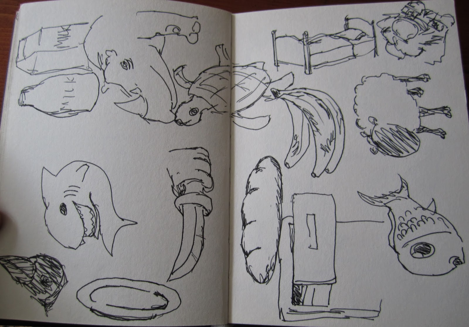
I started by reading and breaking down the text into particularly noteworthy events and passages, that conjured the best visual imagery.
| Initial sketches of passages whilst analysing the text. |
Also since the tale is quite bloody, and based on Little Red Riding Hood, it seemed fitting to have red as theme in the images. I decided the visuals should be black & white with a particular feature highlighted in red. This was easy for the violent scenes and subsequent featuring of blood, but did result is some rather contrived methods of incorporating red into the preceding images.
Preliminary layout roughs for chosen scenes:
| Mildly contrived use of red for the knife handle and the claws of the wolf (also the ring in the previous photo), kinda appropriate for the sock, and obviously works fine for the blood. |
| Red works much better for the scenes after the wolf attack, because of the severed limb. Although, again, bit of a stretch with the spectacle frames. |
| Red on the stones for final image is questionable. |
| Quick summary of the story (spoilers): The protagonist is tasked with delivering a basket to her grandmother. She is also armed with a knife for protection en route. Whilst travelling she is confronted by a wolf, which then attacks her, but she is able to use her knife to cut off its paw. The wolf beats a hasty retreat and Red wipes the blood on her apron and wraps up the severed paw, for reasons. She eventually makes it to Grandma's where she finds said matriarch feverish and delirious in bed. On closer inspection she finds her grandmother's hand has been cut off. She goes to check on the paw and finds it has become a hand - complete with her grandmother's ring. She denounces her granny as a witch and a werewolf and the towns people chase the old lady into the street and stone her to death. |
Labels:
Angela Carter,
Bloody Chamber,
Book,
Carter,
feet,
hands,
illustration,
paw,
red riding hood,
rough,
sketchbook,
sketches,
start,
story,
tale,
university,
werewolf,
wolf
Subscribe to:
Posts (Atom)


