I was pitched a brief, by a company, based on an pro-NHS campaign. They wanted me to come up with some ideas on how to animate the script they'd written.
I sent a written treatment and they requested some style boards for further consideration.
Below are my rough designs (they wanted a specific style):
Showing posts with label images. Show all posts
Saturday, 4 April 2015
Monday, 15 December 2014
Blitzkrieg Bop
I've been tasked, by a band, with designing a logo.
At present I've been given some sample images - one explicitly being the lightning bolt design they want - depicting some classic comicbook-style imagery. Including some pop art and Kryptonian sigils.
I'm awaiting to hear back about a few queries I've had, including colouring, etc. Since I'm unsure if the logo I've been provided is their existing design or just another example piece (it does look a lot like it belongs to Black Adam.)
In the meantime, I've been doing some rough edits on the design and playing with colour variations. Also investigating typefaces, as they would like the band name included in the design.


I'm having to be careful since the colours most of the example images are using are the classic red & yellow, which - when applied to a lightning bolt - basically give you the logo for The Flash.
![]() |
| Examples of potential typefaces. Some may need a little more tweaking than others. |
Wednesday, 29 October 2014
Fight For Your Right...
I recently applied to work at another company that responded asking me to complete a design exercise audition type thing.
I just learnt today that I didn't get an interview, so I've decided to publish the design I did for them.
I had to jazz up a plain text television pitch, for a new show, ready to be sent to a major network. The content of the document is strictly confidential (so I've blurred out the details) but, for context, I will say it was a kinda "teen tropical holiday/party themed reality show".
I wouldn't normally use such a garish colour palette, but it fit with the subject matter of the show.
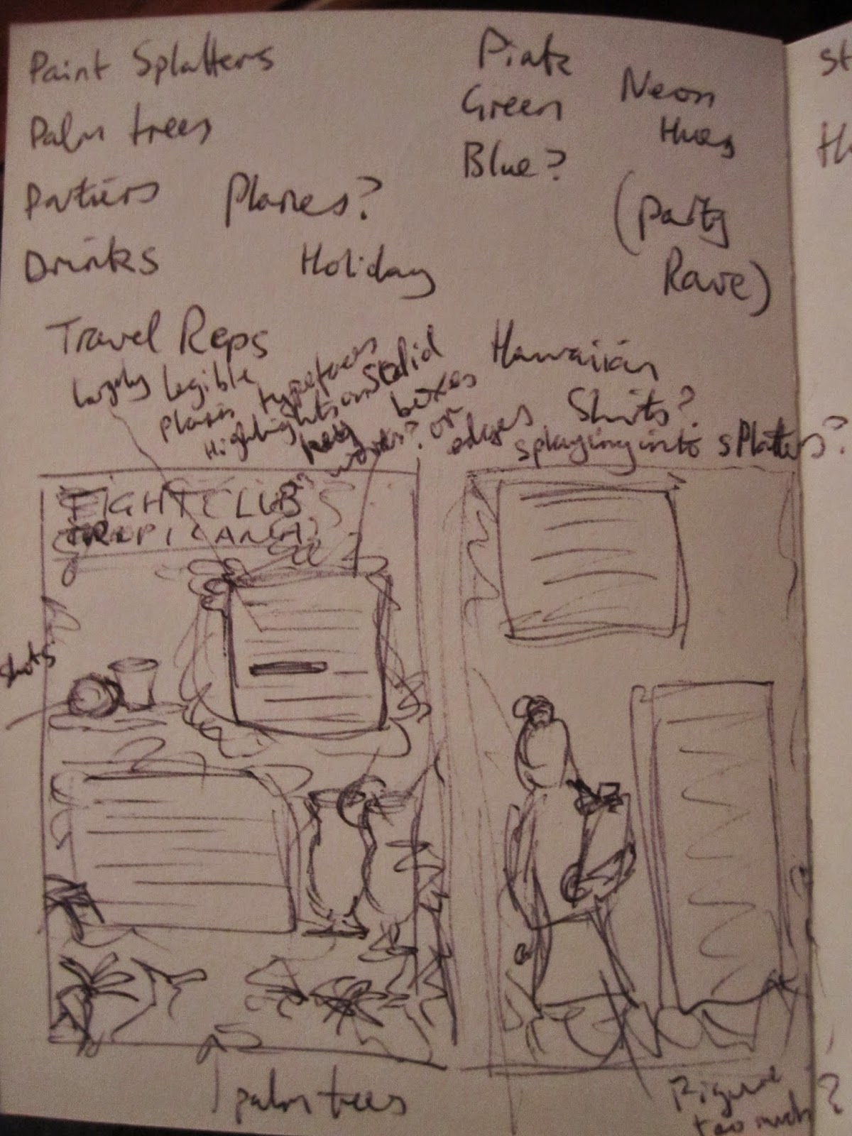
| Preliminary sketches & ideas. |
Labels:
brief,
commission,
design,
exercise,
graphic design,
illustration,
images,
sketchbook,
sketches,
travel,
typography,
vector,
work
Wednesday, 9 July 2014
Comical
Inspired by a project called Twitter The Comic, wherein a group of artists illustrate selected tweets and turn them into short strips, I have decided to practice my comicbook illustration by producing fully-fledged comic pages based on tweets I find amusing.
Below are some preliminary sketches based on two tweets I saw today.
I'll post more when I've collated some finished pages.
Below are some preliminary sketches based on two tweets I saw today.
I'll post more when I've collated some finished pages.
Sunday, 29 June 2014
Book It
I just finished the final touches to my "Gilliam Animation", which I've tentatively titled Book - for want of a better name - and uploaded to Vimeo.
(You can see it here.)
It's taken me far too long to complete, what with laziness, tedium, losing a load of work and being put off and having to find the right live-action elements to include. But it's done.
It's almost ironic that the part of the process I knew the least about and had never attempted before, took me the least amount of time. I started this morning and finished a short while ago. (That was compositing the animation with the live footage of the book.)
I think it worked out well too, considering I took the lazy approach and avoided using After Effects and masks - instead winging it with the limited effects in Premiere and a prayer that the clumsy edits won't be noticeable during viewing. (I don't think they are.)
I'm actually incredibly pleased with how it's come out. Especially how well I managed to make digitally animated scans, combined with footage of a blank page, look like closeup shots of an actual book.
It was challenging given the inconsistent colouring of a lot of the source images (that I probably should've corrected at the first stage rather than last) and I ended up using a lot more and far different effects than I imagined when I first conceptualised it.
In particular not being able to chroma key the image backgrounds and having to add digital shadows to mimic those of the page-turn to make them more seamless.
Below are some screenshots to pique your interest/allow me to show off.
![]() |
| I had to write a load of nonsense to make the scenes look more like real book pages. They're not even complete sentences; there's nothing before the left edge of the shot. |
![]() |
| I'm not going to pretend that I don't think I'm a genius for adding a layer of mirrored text to emulate the look of the adjoining page showing through the paper. |
![]() | |
| I think the overall effect is convincing. I'd believe this is a photo of a book page, and I KNOW that I made it. |
Labels:
animation,
Book,
British Library,
competition,
drawing,
faces,
figures,
illustration,
images,
personal,
public,
public domain,
Terry Gilliam,
video,
vimeo
Thursday, 26 June 2014
Machinations
In my last post, I mentioned my film The Machine.
It's a dark animated short based on Franz Kafka's story "In The Penal Colony".
There is a complete version of it, that I have submitted to festivals, but I personally think it's too short and unfinished (the time constraints of uni, necessitated severe edits to the script).
At the moment I wish to extend it to the level I think is the bear minimum for release, and then hopefully add a little more until it is "properly" finished - at which point I'll release it again as a "director's cut".
Just so you know what it's like and it exists (many people haven't seen it) here are some screenshots I've taken at various points of production.
| |||
| An exasperating issue I noticed during early stages, that I posted on Twitter. |
![]() |
| B&W screenshots as part of the festival submission. |
![]() |
| The submission also required a poster, so this is a rough design I threw together to fulfil that demand. |
Friday, 7 March 2014
Flexercising
I watched a video, the other day, by a Youtuber I follow who is also a bit of an art geek. He has recently enrolled himself on a cartoon course and was relating the various tasks they'd been asked to perform on the course.
They reminded me of some of the drawing exercises I'd done over the years I'd been at uni.
One of which was making a series of quick 30-second drawings of random objects. I found a random object generator online and used a timer set at 30 second intervals to draw the objects listed.
Obviously they're largely imperfect and rough-looking, especially some of the things I obviously find more challenging to draw, but it's a good way to reacquaint myself with drawing, make quick visual decisions and learn what areas I should focus on for improvement.
30 seconds is a surprisingly short amount of time to draw some things, which you don't realise until you're doing it.
Tuesday, 28 January 2014
Terry-ble at updating
I've been working for some time, on-and-off, on this silly little competition project. But I've been very bad at keeping anyone updated on its progress. There came a few stalls when I had some crashes and lost a lot of work - and some of it can get quite tedious to animate, so it's very demotivating to lose it. Additionally, I also intend to splice in some live action footage of an old book. Finding the right book for the job also hindered progress, but I have something now.
Here are a few images to show what caught my eye in the British Library's collection and illustrate the work I did to make them "animateable".
![]() |
| This, I believe, is the original, unedited version of this image that I downloaded. |
![]() |
| Here you can see the edits I made to the base image itself... |
![]() |
| ...and this shows the embellishments and extra elements I added to animate the image. |
![]() |
| Another of the images that caught my eye. |
![]() |
| Side-by-side comparison of the original (right) and the edited version, with cut out elements in the centre. |
![]() |
| Still of one live-action book shots, onto which I intend to superimpose the animations. |
Tuesday, 17 December 2013
Gilliam's Wish Wellingtons
So, it was brought to my attention (by my good friend and fellow artist/animator, Sajan Rai) that the British Library have released a veritable digital treasure trove of old book illustrations that are now public domain.
Thus anyone can use them for any purpose without need for royalty payments and the like.
He suggested that he, I and another friend (Ben Wingrove) have ourselves a small competition to see who can create the best Terry Gilliam-style animation based on some of the imagery available. I'm quite excited by this concept and can't wait to dive in.
Immediately I'm getting ideas from images on the first page. I think I may go a little more towards the style of Mister Harpoon (as he is calling himself now) and the work he did on The Elegant Gentleman's Guide to Knife Fighting. It's an Australian sketch show, which I guess is a modern spin on Monty Python's Flying Circus (live action sketches interspersed with humorous animations).
Subscribe to:
Posts (Atom)


