Showing posts with label illustration. Show all posts

Tuesday, 6 January 2026

emojinal Times

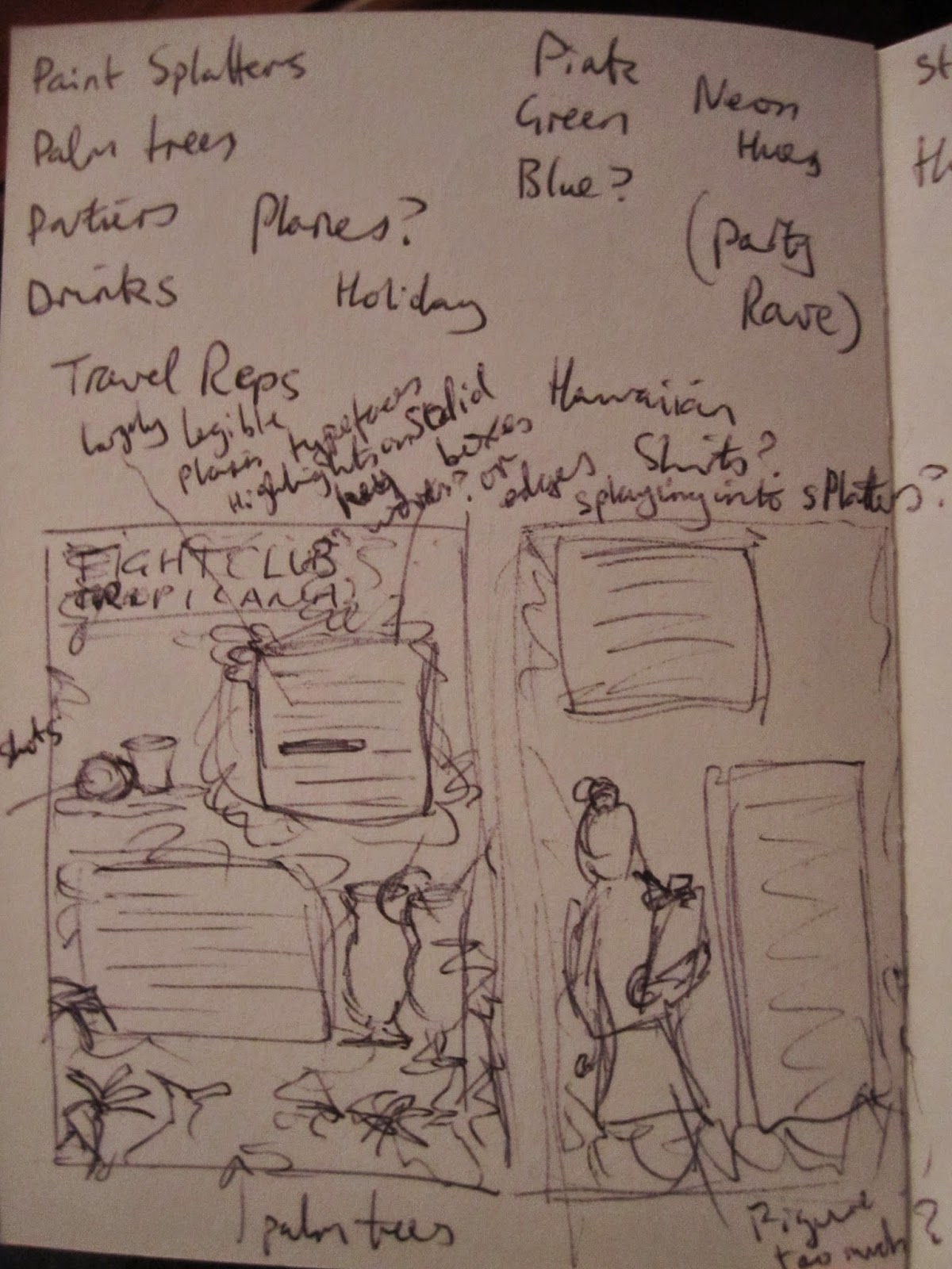
 Bit of a throwback to when I worked on emojitown in 2022. I came on board as a creative producer around episode 36 - helping to shape the interpretations and animation from the scripts, sadly not able to write on the show (although that was the plan if the second season was greenlit!)

I did get to do a couple of voices - but a lot of my creativity went into the thumbnails, especially for the compilations (as they tended to be thematic rather than episode specific) some of my favourites below.

The idea was to create imagery that worked as an engaging YouTube thumbnail, whilst also working as a standalone piece of art or titlecard.

(I didn't 'create' these - they were made by the wonderful animation studio, but I would brief them and sometimes give preliminary character designs and layout sketches of what I was imagining.)


A bit of a Souls-like themed bossfight thumbnail - with a touch of Monster Hunter.


Horror thumbnail, some Stranger Things references as well as the Mystery Inc. gang from Scooby Doo

Superheroes - I designed most of these personas from scratch (Jo's came from E33 Superheroes and Jess' was loosely based on her look from the same episode.)


More superheroes - again, only Unicorn Man and Poophead had existing designs (from a previous compilation thumbnail.)

A really fun Spider-Man reference in this one for the Fleas episode.

Thanksgiving compilation. I just thought what is the most disruptive thing Poophead could do for the holiday.

Julia compilation - had fun leaning into her artist roots for the different styles in the background.


Far from the only thumbnails I worked on - but it's fun looking back on the show after so long.

Friday, 24 October 2025

Omchat

Updates on the illustration I did for the Omcha tea labels. My work has started rolling out on the products!

I got some beautiful official product photos from owner Meg, and it's really amazing to see my images sitting within context on a real product. That people can buy!


photos provided by Omcha.


Tuesday, 3 June 2025

Get That (Tea) Bag!

 It's been a lengthy time chipping away at the list of designs - but the Omcha label project is finally complete!


I have yet to see any of the images in print or packaging - but I will share as soon as I get any updates.


It was a lovely project and I'm happy to have been commissioned to make them.

Do please buy some tea from Meg, if you are so inclined. Depending on when you're reading this - it might even come with one of my illustrations on it!

Omcha.co.uk - people and planet friendly teas and events.


Saturday, 1 February 2025

Omcha Branding Project

Following on from the success of the animated brewing guide, I have been commissioned to make a series of bespoke packaging labels for all the tea varieties and blends in the Omcha range - to keep a consistent visual language with the imagery I already made. 


It's an exciting (if slightly daunting) project, and I'm thrilled to have the opportunity. In short time my illustrations will be on packaging for people to purchase around the world!


partial list of illustrations

I'm already working through a large list of possible labels that I've been given - which will be used for current or future tea products.


Some work in progress images. The range is expected to launch around June 2025.


Thursday, 30 January 2025

Omcha Tea Guide

 I'm so happy to announce that the final version of the animated tea brewing guide is now available!


This was a great project and I look forward to future collaborations with Omcha!

Wednesday, 29 October 2014

Fight For Your Right...

I recently applied to work at another company that responded asking me to complete a design exercise audition type thing.
I just learnt today that I didn't get an interview, so I've decided to publish the design I did for them.

I had to jazz up a plain text television pitch, for a new show, ready to be sent to a major network. The content of the document is strictly confidential (so I've blurred out the details) but, for context, I will say it was a kinda "teen tropical holiday/party themed reality show".


I wouldn't normally use such a garish colour palette, but it fit with the subject matter of the show.

Preliminary sketches & ideas.
 

Wednesday, 1 October 2014

Tiny Twelve

It has been some time since I've heard from the company that requested this test commission, so I'm assuming I have not been selected.
To that end, I am publishing my design.

It's a likeness of Peter Capaldi (in costume as the Twelfth Doctor) in the established style of the company. I'm quite pleased with it, even if they obviously feel it's not enough to hire me over.
 

Thursday, 18 September 2014

Sibling

An offhand comment on Twitter lead me to draw this stupid portrait of my brother.
It's not perfect, and you can tell I put more time into the face than anything else, but it's a good exercise in digital drawing.


Tuesday, 16 September 2014

Face Off

I applied to a company that creates stylised likenesses of celebrities for use on a variety of products, their response was to request that I demonstrate my capability to create imagery in their established brand style.

I have begun working on something.


Having tweeted it without context, people have managed to identify the individual in question. Which is a good sign.

Wednesday, 9 July 2014

Comical

Inspired by a project called Twitter The Comic, wherein a group of artists illustrate selected tweets and turn them into short strips, I have decided to practice my comicbook illustration by producing fully-fledged comic pages based on tweets I find amusing.

Below are some preliminary sketches based on two tweets I saw today.


 I'll post more when I've collated some finished pages.

Sunday, 29 June 2014

Book It

I just finished the final touches to my "Gilliam Animation", which I've tentatively titled Book - for want of a better name - and uploaded to Vimeo.

(You can see it here.)

It's taken me far too long to complete, what with laziness, tedium, losing a load of work and being put off and having to find the right live-action elements to include. But it's done.

It's almost ironic that the part of the process I knew the least about and had never attempted before, took me the least amount of time. I started this morning and finished a short while ago. (That was compositing the animation with the live footage of the book.)

I think it worked out well too, considering I took the lazy approach and avoided using After Effects and masks - instead winging it with the limited effects in Premiere and a prayer that the clumsy edits won't be noticeable during viewing. (I don't think they are.)

I'm actually incredibly pleased with how it's come out. Especially how well I managed to make digitally animated scans, combined with footage of a blank page, look like closeup shots of an actual book.
It was challenging given the inconsistent colouring of a lot of the source images (that I probably should've corrected at the first stage rather than last) and I ended up using a lot more and far different effects than I imagined when I first conceptualised it.
In particular not being able to chroma key the image backgrounds and having to add digital shadows to mimic those of the page-turn to make them more seamless.

Below are some screenshots to pique your interest/allow me to show off.

I had to write a load of nonsense to make the scenes look more like real book pages. They're not even complete sentences; there's nothing before the left edge of the shot.

I'm not going to pretend that I don't think I'm a genius for adding a layer of mirrored text to emulate the look of the adjoining page showing through the paper.

I think the overall effect is convincing. I'd believe this is a photo of a book page, and I KNOW that I made it.
 

Saturday, 19 April 2014

Faces in Places

I've been doing a fair bit of travelling recently; taking my sketchbook about with me to practice sketching during my downtime. I realise now why there's so prevalent a cliché of illustrators drawing on trains.

Sleeping woman on a train to Birmingham

The challenge is getting faces without people noticing you staring at them. Easier when they're further away, but harder to see details.


Workmen on a break outside the station

Travellers waiting at the station

Figures on the left were on a train, chap at the top in a cafe.

Saturday, 15 March 2014

A Foot Note

I drew this critter on a whim, late last night.


I noticed his hands and feet were quite catastrophic. I've been meaning to work on my hand and feet drawings (it's something a lot of people struggle with) so I started doing studies from image and live references.


Friday, 7 March 2014

Flexercising

I watched a video, the other day, by a Youtuber I follow who is also a bit of an art geek. He has recently enrolled himself on a cartoon course and was relating the various tasks they'd been asked to perform on the course.
They reminded me of some of the drawing exercises I'd done over the years I'd been at uni.

One of which was making a series of quick 30-second drawings of random objects. I found a random object generator online and used a timer set at 30 second intervals to draw the objects listed.
Obviously they're largely imperfect and rough-looking, especially some of the things I obviously find more challenging to draw, but it's a good way to reacquaint myself with drawing, make quick visual decisions and learn what areas I should focus on for improvement.


30 seconds is a surprisingly short amount of time to draw some things, which you don't realise until you're doing it.

Tuesday, 4 March 2014

Started a new sketchbook

Using this to carry with me for sketching on the go. Had to do something garish, terrible and stupid so I felt less precious about marking in a fresh book.

Tuesday, 28 January 2014

Terry-ble at updating

I've been working for some time, on-and-off, on this silly little competition project. But I've been very bad at keeping anyone updated on its progress. There came a few stalls when I had some crashes and lost a lot of work - and some of it can get quite tedious to animate, so it's very demotivating to lose it. Additionally, I also intend to splice in some live action footage of an old book. Finding the right book for the job also hindered progress, but I have something now.

Here are a few images to show what caught my eye in the British Library's collection and illustrate the work I did to make them "animateable".
This, I believe, is the original, unedited version of this image that I downloaded.


Here you can see the edits I made to the base image itself...

...and this shows the embellishments and extra elements I added to animate the image.


Another of the images that caught my eye.

Side-by-side comparison of the original (right) and the edited version, with cut out elements in the centre.
Still of one live-action book shots, onto which I intend to superimpose the animations.

Tuesday, 17 December 2013

Gilliam's Wish Wellingtons

So, it was brought to my attention (by my good friend and fellow artist/animator, Sajan Rai) that the British Library have released a veritable digital treasure trove of old book illustrations that are now public domain.
Thus anyone can use them for any purpose without need for royalty payments and the like.


He suggested that he, I and another friend (Ben Wingrove) have ourselves a small competition to see who can create the best Terry Gilliam-style animation based on some of the imagery available. I'm quite excited by this concept and can't wait to dive in.

Immediately I'm getting ideas from images on the first page. I think I may go a little more towards the style of Mister Harpoon (as he is calling himself now) and the work he did on The Elegant Gentleman's Guide to Knife Fighting. It's an Australian sketch show, which I guess is a modern spin on Monty Python's Flying Circus (live action sketches interspersed with humorous animations).

Tuesday, 20 November 2012

More Carter

At this stage in the project, the overall layouts and imagery have been finalised, but there are 3 potential stylistic options for the final imagery: Handdrawn linework, Vector graphics or Inkwash drawings.
The ink drawings were definitely the first intended final images, but the simplicity of the line images is much clearer to read. Unfortunately they're not as clean as the vector graphics, but the latter have a stale quality to them.
I'm not sure I really like the way this project is panning out.
In addition to the images, I drew out some hand-rendered lettering for the story to be written in. The one I chose is based on ornate, slightly gothic-looking serif typefaces I looked at.


The lengthy passages mean I had to convert the letters into an actual font, so I could just type out what was needed, rather than assemble it by hand. It's called CarterScript and it's not a functional typeface, per se, more just a means of creating large volumes of readily formatted words in the letters for me to edit.


Examples of the vector versions of the scene elements I'm using to illustrate the story.