Sunday 30 March 2014

Logo a-go-go

So, I've been working to implement the notes and suggested improvements given to me from the meeting last week.
I thought I'd throw out a little update while I have an opportunity in the middle of it all.

One of the changes is that header image/logo. The suggestion was that the sunburst was too subtle and it needed to be brought out (the consensus was make it brighter and/or yellow). So I did.
Here you can see the original logo that is currently used by the group. I believe it's an old woodcut print.

This is the original design that was pitched. As you can see the colours are all integrated with the general palette of the site itself. However the sunburst's green is very close to that of the background (although, that was intentional. It was more of a nod to the original logo design/a means of making the background less boring.)
This is the first alternate logo I drew up. One of the suggestions, aside from making the sunburst yellow, was to make the background red to match. I felt this was too bold a step, so I went for a slightly less harsh orange. However, this really offsets the light green of the font and additionally doesn't sit cohesively with the rest of the website. Perhaps changing the font colours would make this a better looking design overall, but it would still stick out on the page itself.
This is the third change I made. I am probably going to stick with this come the review. I'm still not totally happy with it, but we'll see what the board thinks. I tried switching back to the original green background with the new yellow sunburst, but it was too dark. I moved it away from blue towards a lighter green. I additionally drew some of the saturation and orange hue out of the yellow as the warmth made it quite jarring against the green - even with its adjustment. I think it makes it harder to read the font over the top and draws attention, but I don't know how much more subtle I can make it without it changing to a horrid greeny-yellow hue/switching back to the original colour.
It remains to be seen what the feedback is on the change - perhaps they will agree that the first logo was probably the best colour choice after all. Addtionally, I checked what typeface I had used for the logo, so it can potentially be used for rebranding. It's Myriad Pro - an Adobe font - commonly utilised by a number of established quality brands, including: Apple, Rolls-Royce and Google (for their Gmail logo).

Wednesday 26 March 2014

Painful Progress

Finally, after an excessive amount of time, I was called in to a meeting with the board of directors to talk about the website.
At first I was expecting to just be discussing with the chairman, but walking in I was greeted by the entire board and expected to do a presentation with absolutely no prep.

It went surprisingly well, the only downside being my inarticulate explanation (literally no preparation, I swear to Moses) and accidentally clicking on nearly every dead link on the example site.
Thankfully they were all pleased and in agreement over the overall design of the site, so that means no tweaking from me and I can finally finish the bloody thing!

The only things they asked for improvement on were the main header logo. They wanted the sunburst more prominent and perhaps a change in colour to pick it out more from the rest of the site. But they liked it so much that there was talk of adapting all their letterheads and the like to match it.

Current header logo. A warmer colour palette may be in order to pick out the sun and/or highlight the whole thing.


Additionally, they also asked for a few more pages to be added to the navigation, and room to add login and member page functionality - which, at first, I thought was being asked in an attempt to trip me up. Thankfully, I kept my cool and managed to decipher what was required. Also I remembered I hadn't been briefed really on any of that, so it was hardly surprising I was taken off-guard by the request.

Hopefully, though, once I have completed these tasks it can be uploaded to the server to be populated by whoever is supplying the finished copy and photographic imagery. Then I shall be done with this whole shebang! Onto the next quest!

Saturday 15 March 2014

A Foot Note

I drew this critter on a whim, late last night.


I noticed his hands and feet were quite catastrophic. I've been meaning to work on my hand and feet drawings (it's something a lot of people struggle with) so I started doing studies from image and live references.


Friday 7 March 2014

Flexercising

I watched a video, the other day, by a Youtuber I follow who is also a bit of an art geek. He has recently enrolled himself on a cartoon course and was relating the various tasks they'd been asked to perform on the course.
They reminded me of some of the drawing exercises I'd done over the years I'd been at uni.

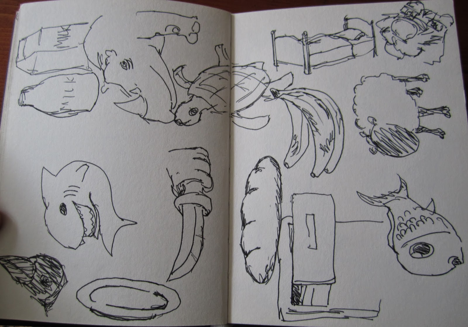
One of which was making a series of quick 30-second drawings of random objects. I found a random object generator online and used a timer set at 30 second intervals to draw the objects listed.
Obviously they're largely imperfect and rough-looking, especially some of the things I obviously find more challenging to draw, but it's a good way to reacquaint myself with drawing, make quick visual decisions and learn what areas I should focus on for improvement.


30 seconds is a surprisingly short amount of time to draw some things, which you don't realise until you're doing it.

Tuesday 4 March 2014

Started a new sketchbook

Using this to carry with me for sketching on the go. Had to do something garish, terrible and stupid so I felt less precious about marking in a fresh book.