I was pitched a brief, by a company, based on an pro-NHS campaign. They wanted me to come up with some ideas on how to animate the script they'd written.
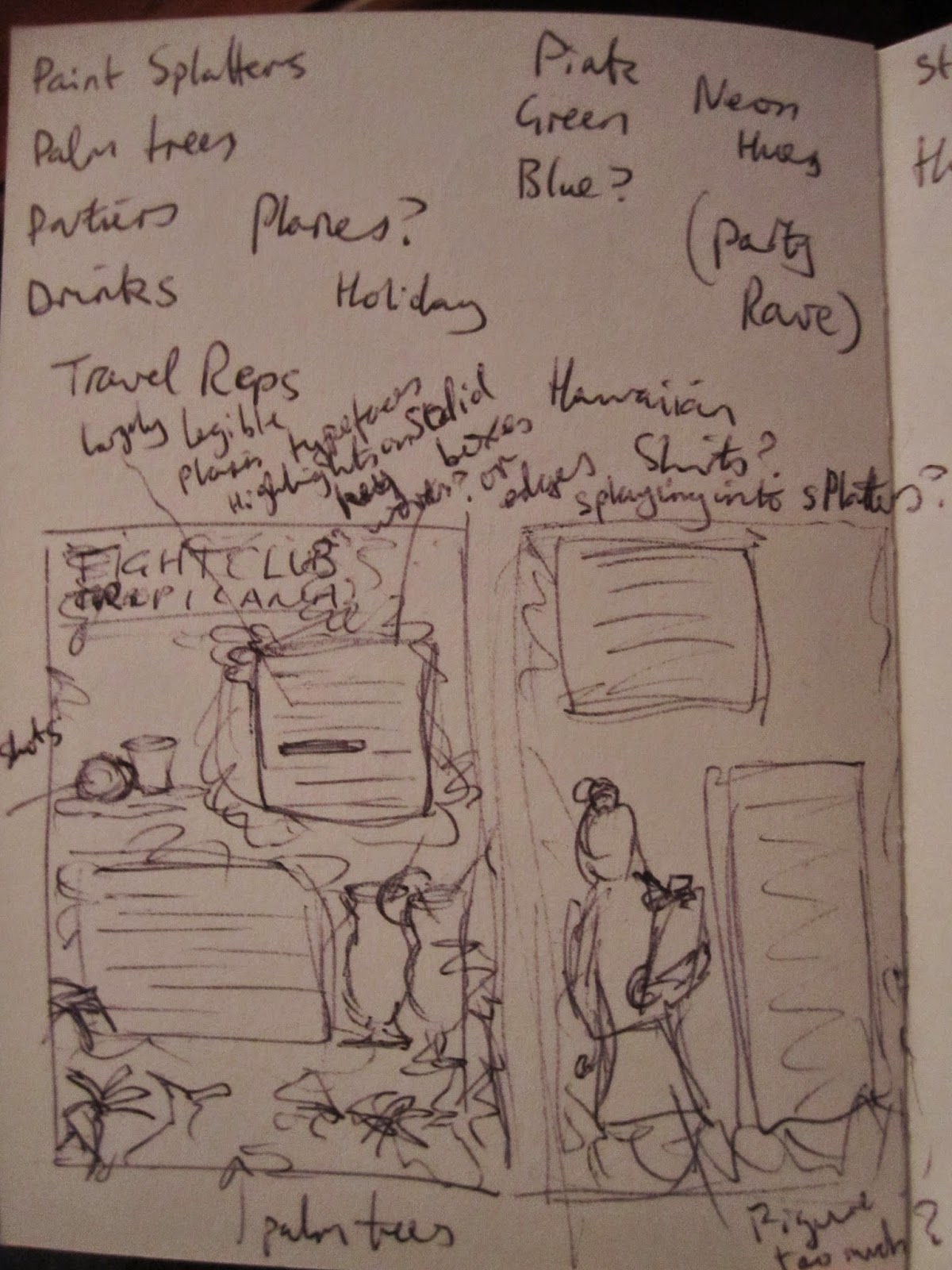
I sent a written treatment and they requested some style boards for further consideration.
Below are my rough designs (they wanted a specific style):
Showing posts with label vector. Show all posts
Saturday, 4 April 2015
Wednesday, 29 October 2014
Fight For Your Right...
I recently applied to work at another company that responded asking me to complete a design exercise audition type thing.
I just learnt today that I didn't get an interview, so I've decided to publish the design I did for them.
I had to jazz up a plain text television pitch, for a new show, ready to be sent to a major network. The content of the document is strictly confidential (so I've blurred out the details) but, for context, I will say it was a kinda "teen tropical holiday/party themed reality show".
I wouldn't normally use such a garish colour palette, but it fit with the subject matter of the show.
Preliminary sketches & ideas. |
Labels:
brief,
commission,
design,
exercise,
graphic design,
illustration,
images,
sketchbook,
sketches,
travel,
typography,
vector,
work
Wednesday, 1 October 2014
Tiny Twelve
It has been some time since I've heard from the company that requested this test commission, so I'm assuming I have not been selected.
To that end, I am publishing my design.
It's a likeness of Peter Capaldi (in costume as the Twelfth Doctor) in the established style of the company. I'm quite pleased with it, even if they obviously feel it's not enough to hire me over.
To that end, I am publishing my design.
It's a likeness of Peter Capaldi (in costume as the Twelfth Doctor) in the established style of the company. I'm quite pleased with it, even if they obviously feel it's not enough to hire me over.
Labels:
brief,
celebrity,
clothes,
commission,
design,
Doctor Who,
drawing,
faces,
figures,
graphic design,
illustration,
people,
Peter Capaldi,
portraits,
vector,
work
Tuesday, 20 November 2012
More Carter
At this stage in the project, the overall layouts and imagery have been finalised, but there are 3 potential stylistic options for the final imagery: Handdrawn linework, Vector graphics or Inkwash drawings.
The ink drawings were definitely the first intended final images, but the simplicity of the line images is much clearer to read. Unfortunately they're not as clean as the vector graphics, but the latter have a stale quality to them.
I'm not sure I really like the way this project is panning out.
In addition to the images, I drew out some hand-rendered lettering for the story to be written in. The one I chose is based on ornate, slightly gothic-looking serif typefaces I looked at.
The lengthy passages mean I had to convert the letters into an actual font, so I could just type out what was needed, rather than assemble it by hand. It's called CarterScript and it's not a functional typeface, per se, more just a means of creating large volumes of readily formatted words in the letters for me to edit.
Examples of the vector versions of the scene elements I'm using to illustrate the story.
Subscribe to:
Posts (Atom)